SD Zoo.jpg

San Diego Zoo

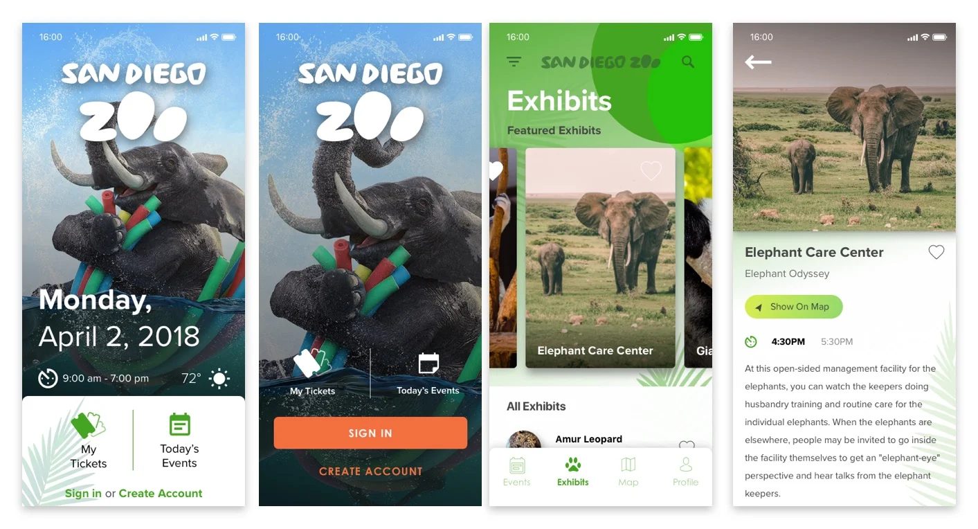
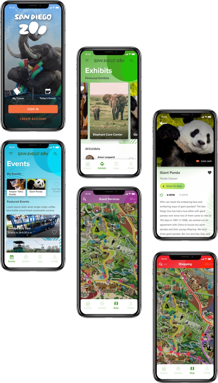
A super fun PoC when I joined the Seamgen team was for the San Diego Zoo. As you know or maybe you don't but the San Diego Zoo still uses paper maps! Not only is this not environmentally friendly it also costs them more money to print maps daily. This concept was to move off the paper maps and on to the digital screen, so users can still find there favorite animals and attractions. Working closely with another senior designer Chris Raeside this is what I came up with for login, attractions on the map and the exhibits. The challenge here was to make the UX as easy as possible while making the app fun as we had to take all user ages into consideration.

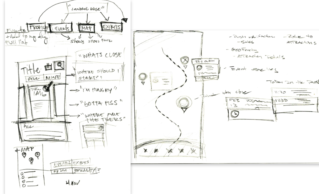
Started with some light sketches and taking in the map.

zoo-sketches.jpg

Since this was a PoC we dove right into some visual comps. This was my first round of visuals, but we needed it to be a tad bit more fun.

zoo - jumping off point.jpg

I then started to play with some images from a fun campaign the Zoo had produced, and added in more color. I wanted to use the colors from the map attractions in the app so users had a sense of familiarity.  

zoo - dialin in comps .jpg
maps views.jpg
SD-zoo-concepts.jpg